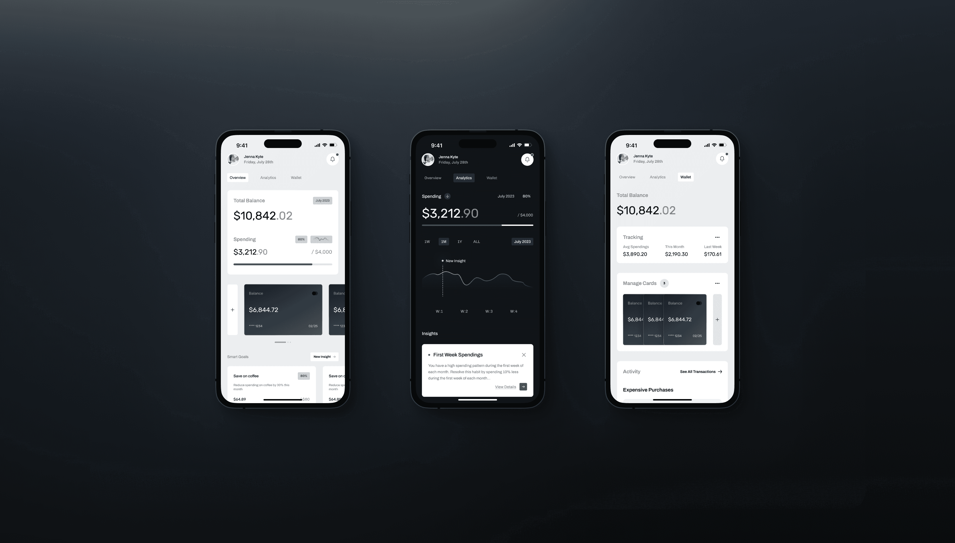
SPENDFLOW
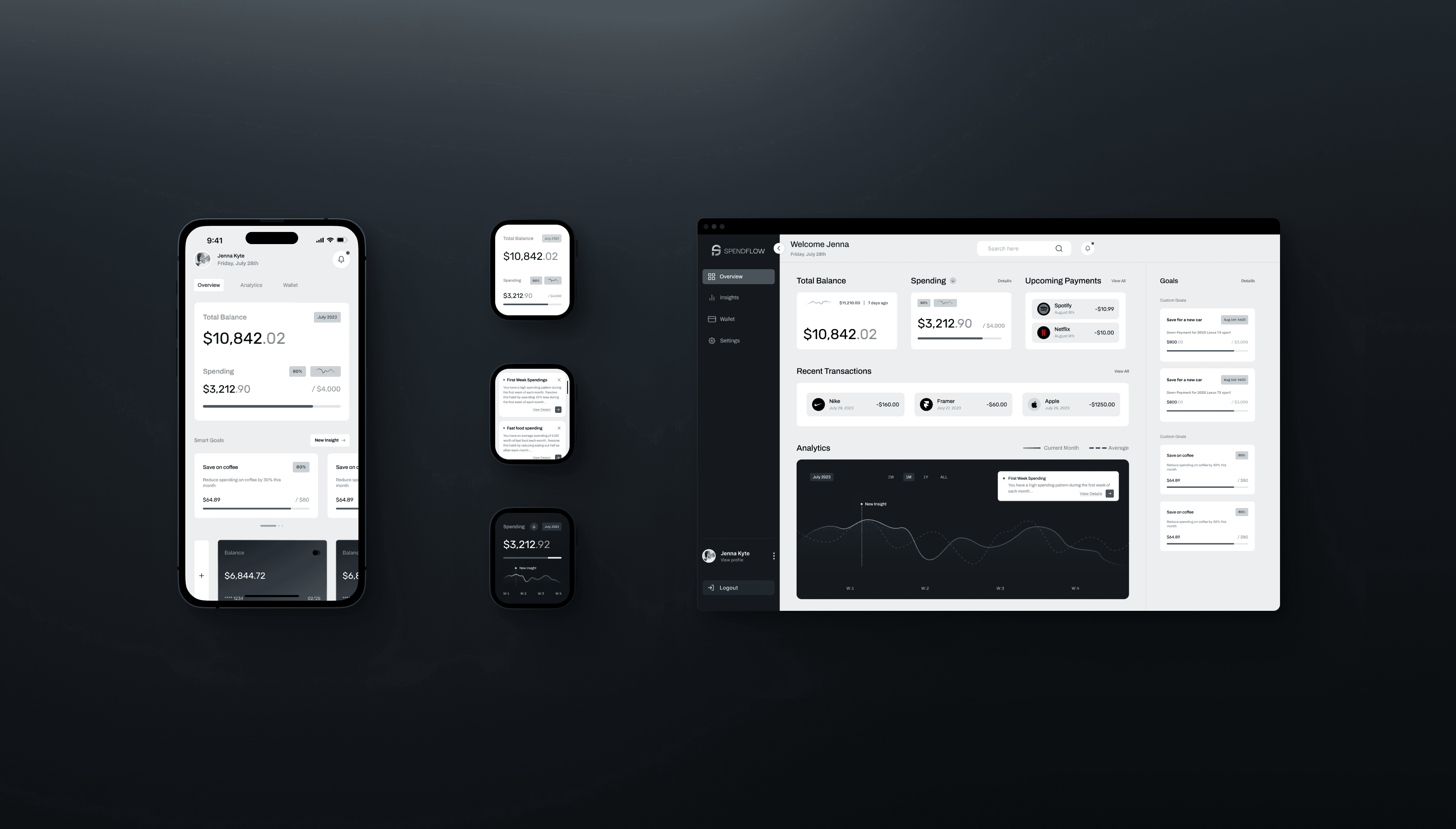
This fintech project was an exploration of empowering individuals to take control of their financial well-being through streamlined budgeting, insightful financial analytics, and intuitive expense tracking. The goal was to provide users with a comprehensive tool for optimizing their financial decisions and achieving their goals while reimagining their interaction with personal finances.
Role
Sole Product Designer
Timeline
May 2023 - July 2023
Context
Personal Project
CHALLENGE
Managing personal finances often presents challenges, with individuals facing difficulty in creating adequate budgets, understanding spending patterns, and gaining meaningful insights into financial behaviors. Many existing financial apps lack an engaging and intuitive design and interface, which can discourage users from actively engaging with their finances.
SOLUTION
The solution to this challenge required highlighting unique elements that guide the problem, including aspects like, budget management, perceptive financial data analyses, and user-friendly spending monitoring. The task further demanded meticulous consideration to design specifics to ascertain the operations were user-friendly and the flows were easy to comprehend.
PROCESS
RESEARCH
01
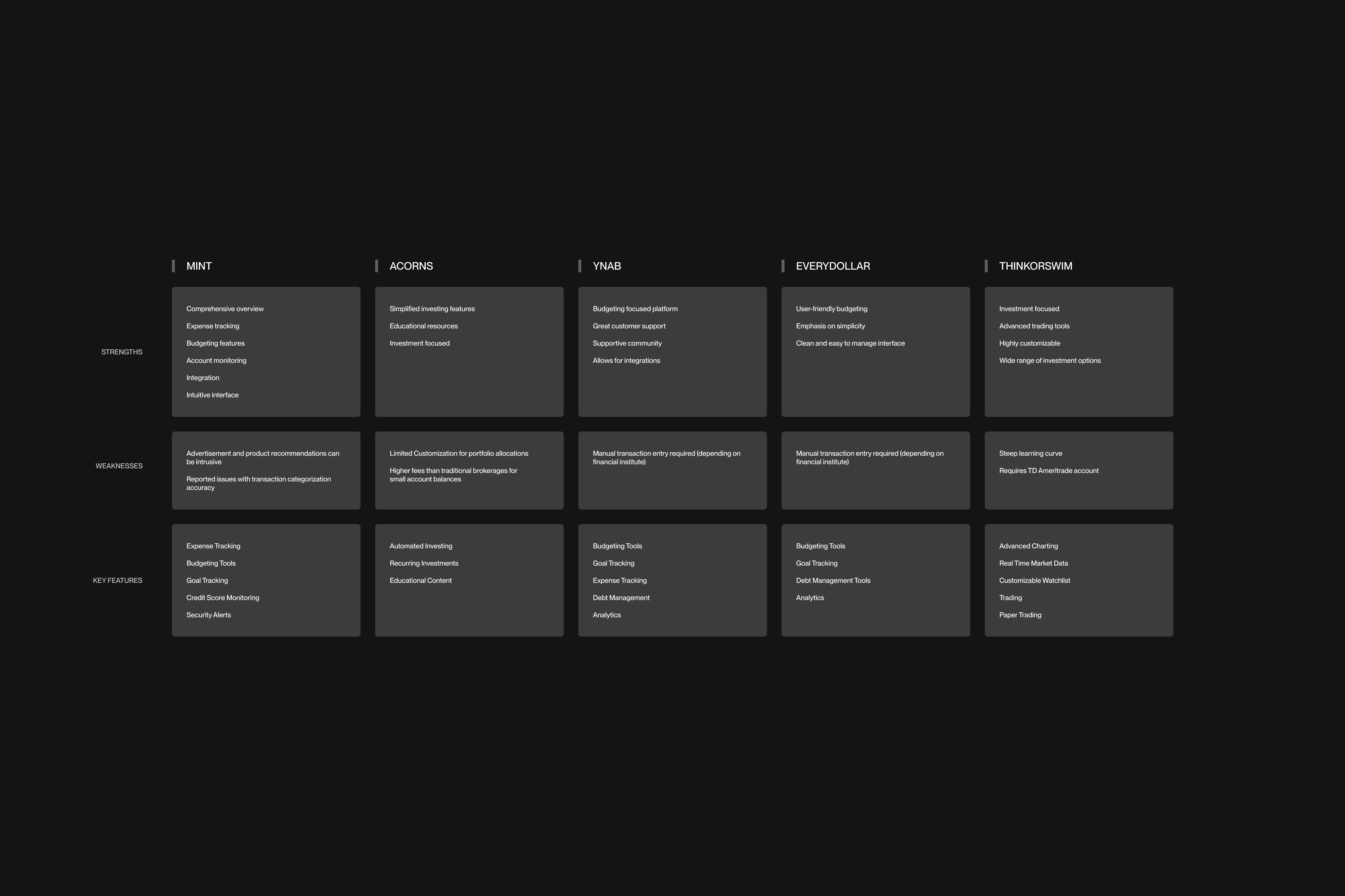
COMPETITIVE ANALYSIS
To kick off this project, I started by analyzing competitors. With this, I was able to learn from their successes and failures. This key step allowed me to identify what they were doing well and what they were not, and I used this information to influence the path of this project in a positive direction.
USER INTERVIEWS
In order to continue to keep this product aligned with the goal of creating a user-centric experience, gathering insights from users themselves was the obvious choice for the next steps. This would allow me to better understand needs, pain points, and expectations.
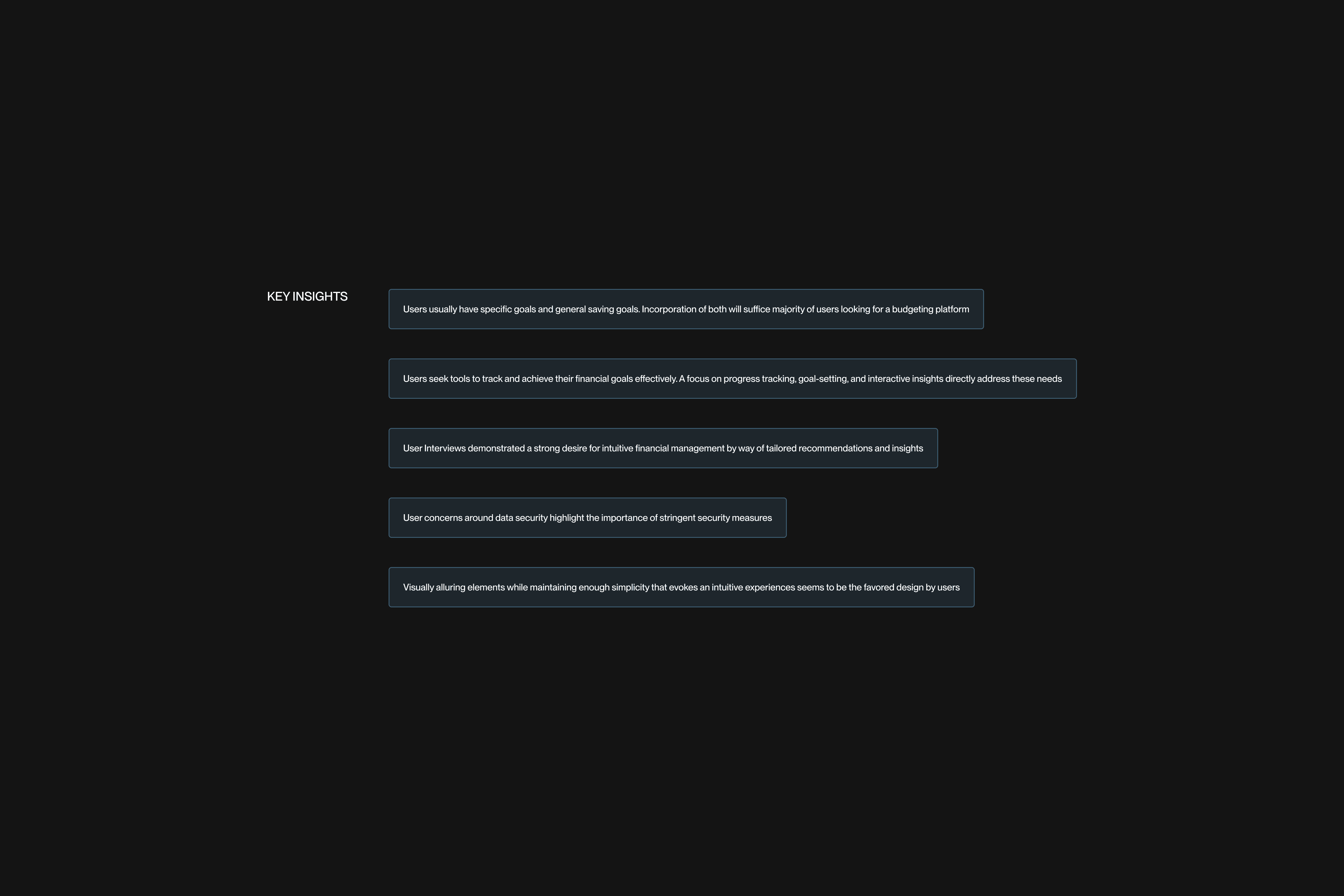
KEY INSIGHTS
After conducting research, I synthesized key insights that would drive the conception, structure, and features, all grounded on a comprehensive evaluation of user requirements and desires.
IDEATION
02
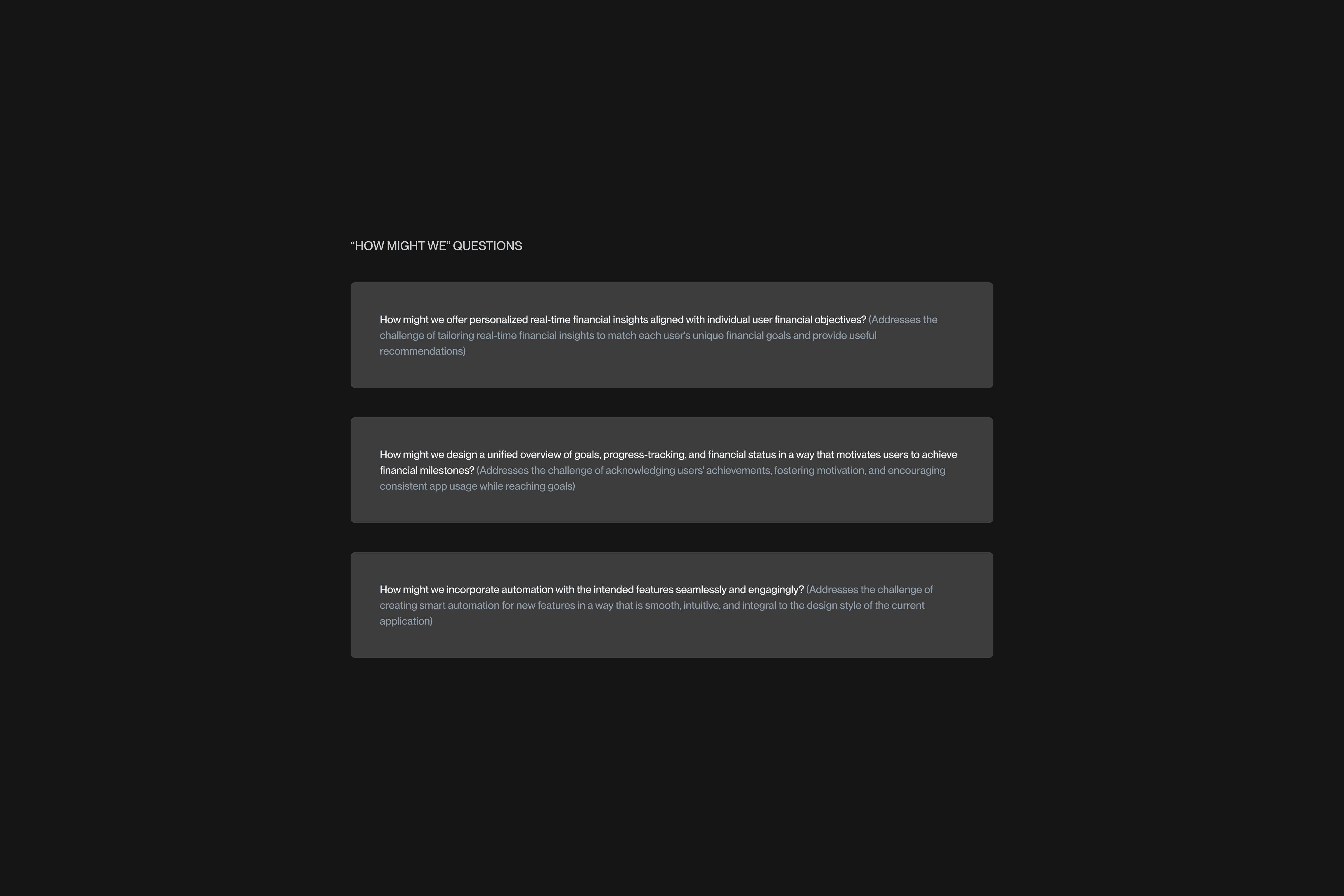
FRAMING THE CHALLENGE
To reinforce the project's objective, I converted the insights from the research phase into "How Might We" questions, tailored to meet user requirements and aims. This method enabled me to understand challenges from the users' standpoint.
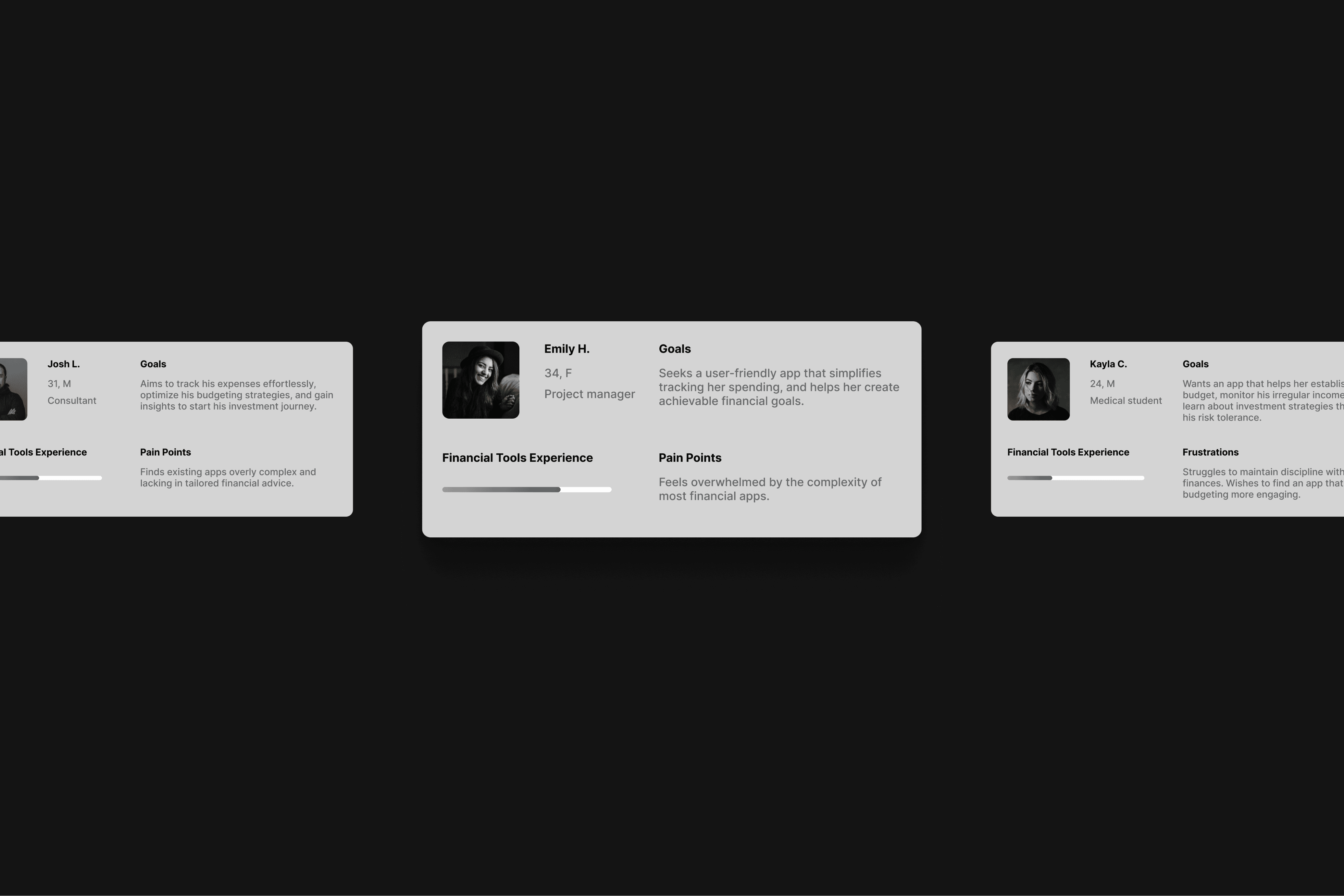
USER PERSONAS
The creation of User Personas fulfilled the objective of having a general reference point that represented the users based on the research. With this, sympathizing and architecting a purpose-built solution was inevitable.
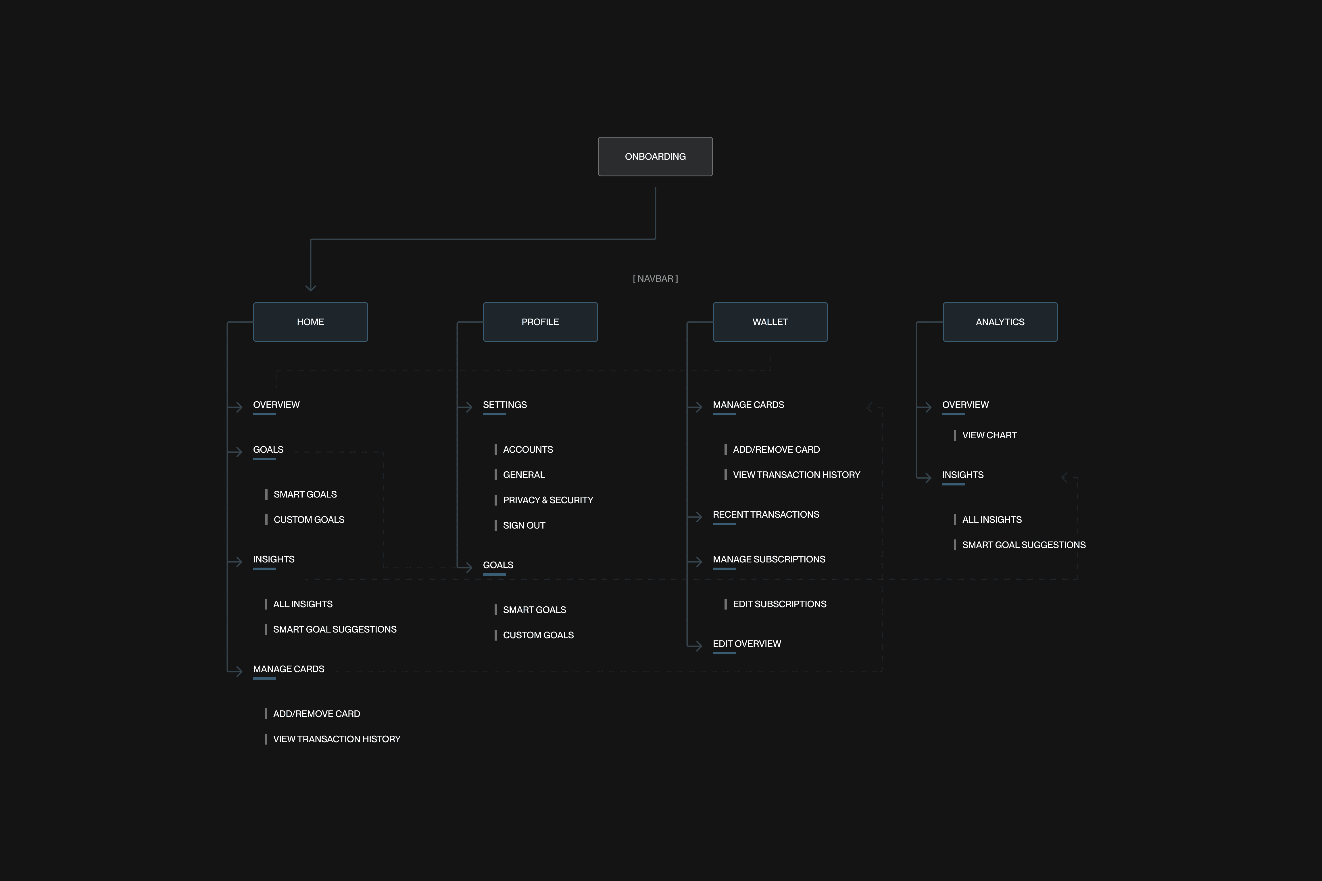
SITEMAP
I then built a simple yet thoughtful Sitemap, making understanding flows and designing wireframes an easy process.
DESIGN
03
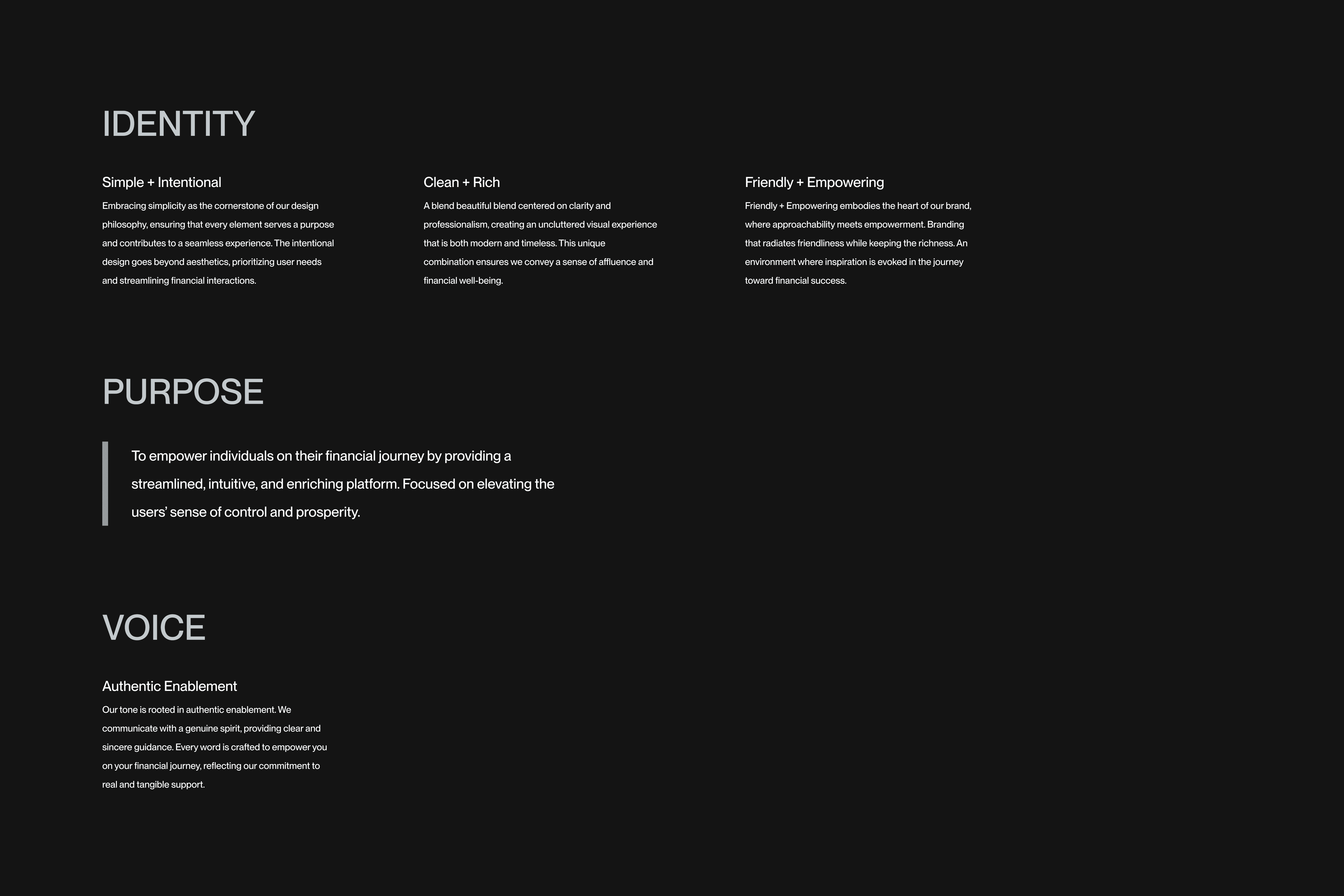
BRAND ETHOS
After ideating, establishing a brand became the priority. I created an ethos to clearly define the identity, purpose, and voice of the brand that would be behind and built for the goal and purpose of the product.
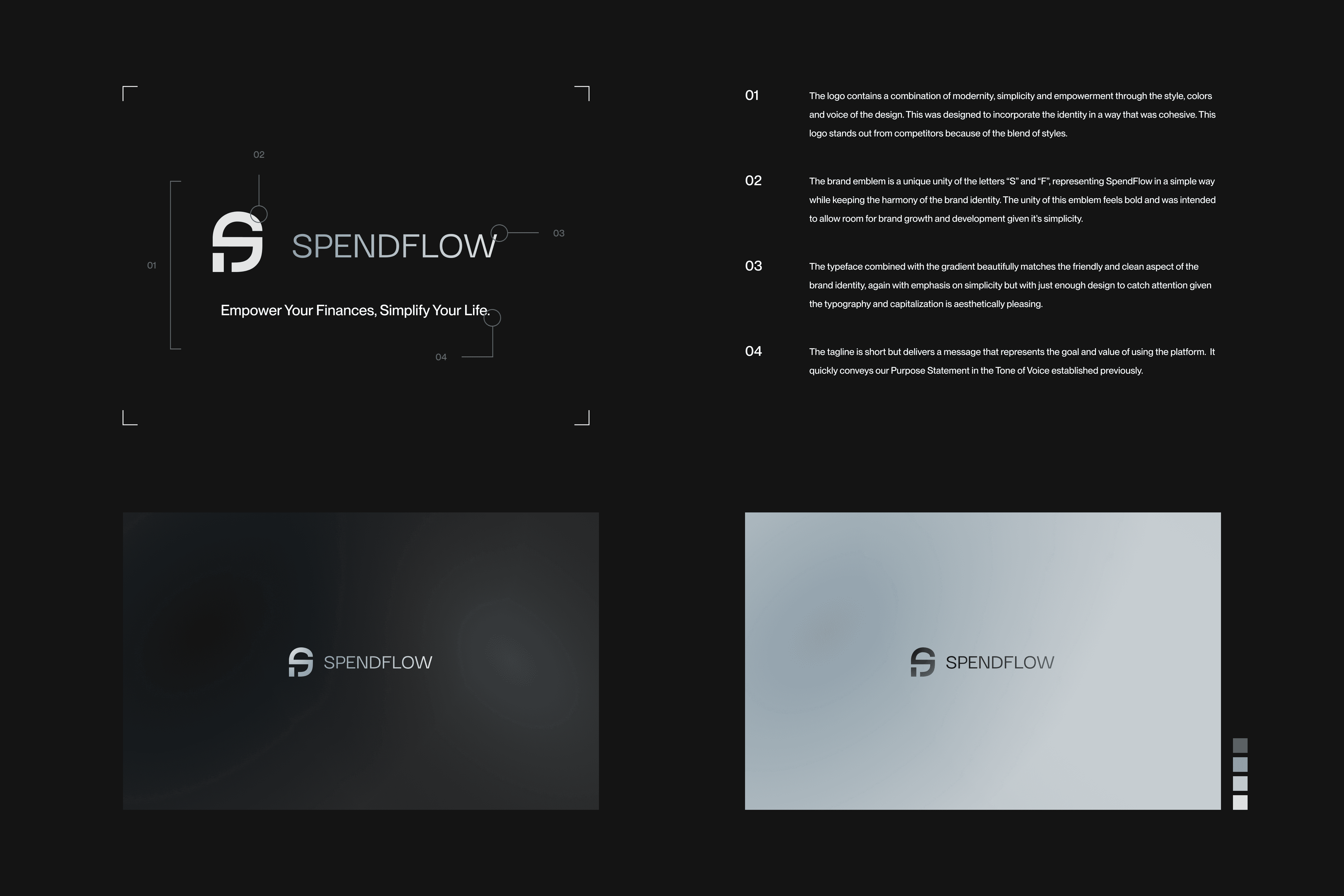
NAME + LOGO
When creating the name and logo, I cycled through a variety of ideas, sketches and styles that felt modern and consistent with the brand ethos. The brand ended with a simple yet powerful name, a logo that was modern and a tagline that encompassed the purpose of the brand.
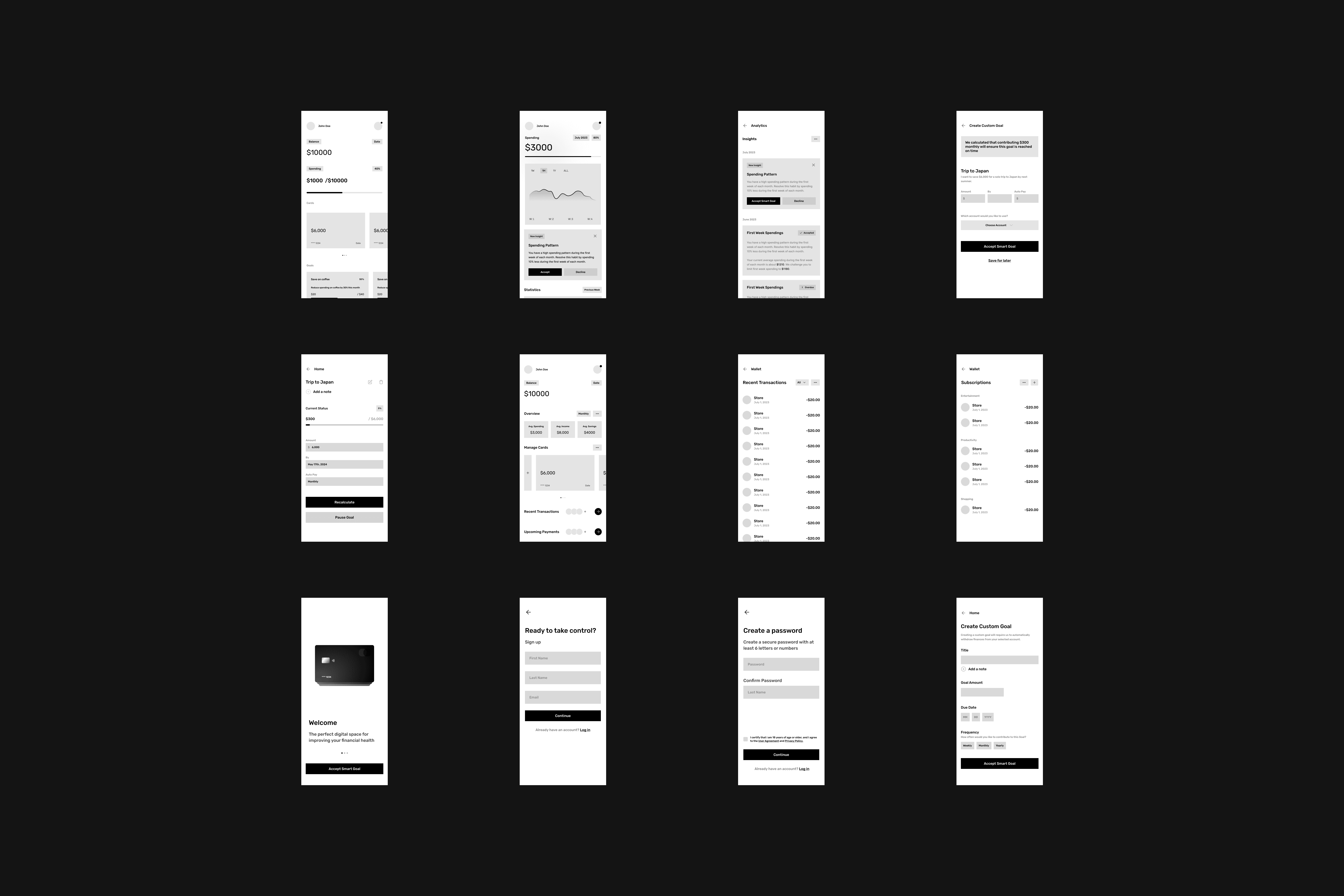
LOW FIDELITY WIREFRAMES
Next I produced low fidelity wireframes and generated visual concepts for screens that I could further refine during the process of creating High Fidelity Screens.
HIGH FIDELITY SCREENS
In the process of producing the screens, my principal priority was a thorough approach, recognizing the importance of precision and attention to detail. This deliberate focus not only enhanced the aesthetic appeal of the final output, but it also ensured user-focused functionality was present.
GOALS
The biggest and most effective features are hidden in the Custom and Smart Goals. Smart Goals take spending insights and analytics and suggest a goal to improve spending; "Reduce fast food spending by 20% monthly", "Limit retail shopping to a $100 monthly average" and so on. Smart Goals take information and turn them into actionable steps, whereas Custom Goals are vaults that withdraw from a selected account with a desired frequency to reach a goal; "Save for Japan", "Save for car down payment".
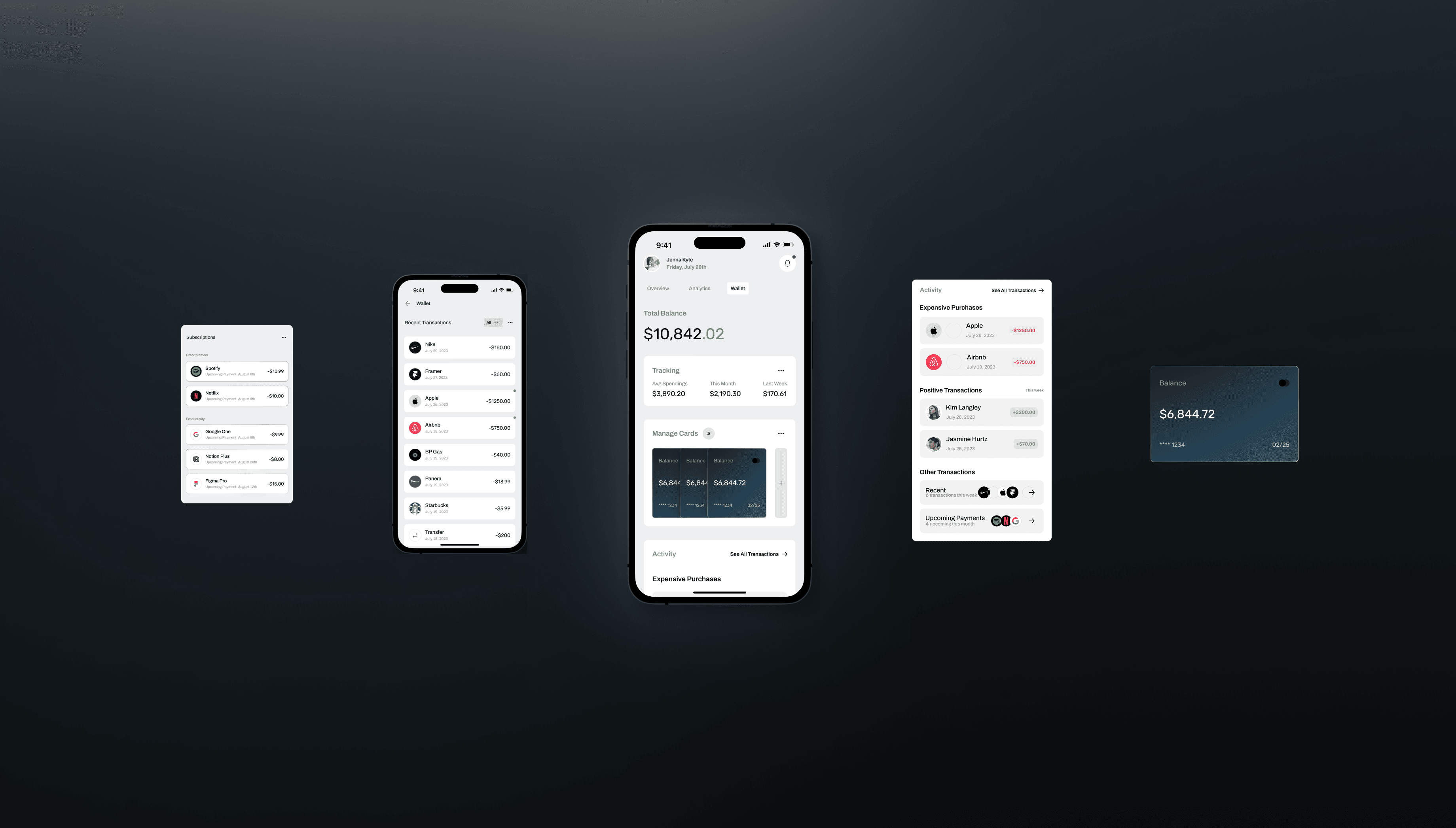
WALLET
The Wallet was designed with attention to spending patterns and easy transaction tracking.
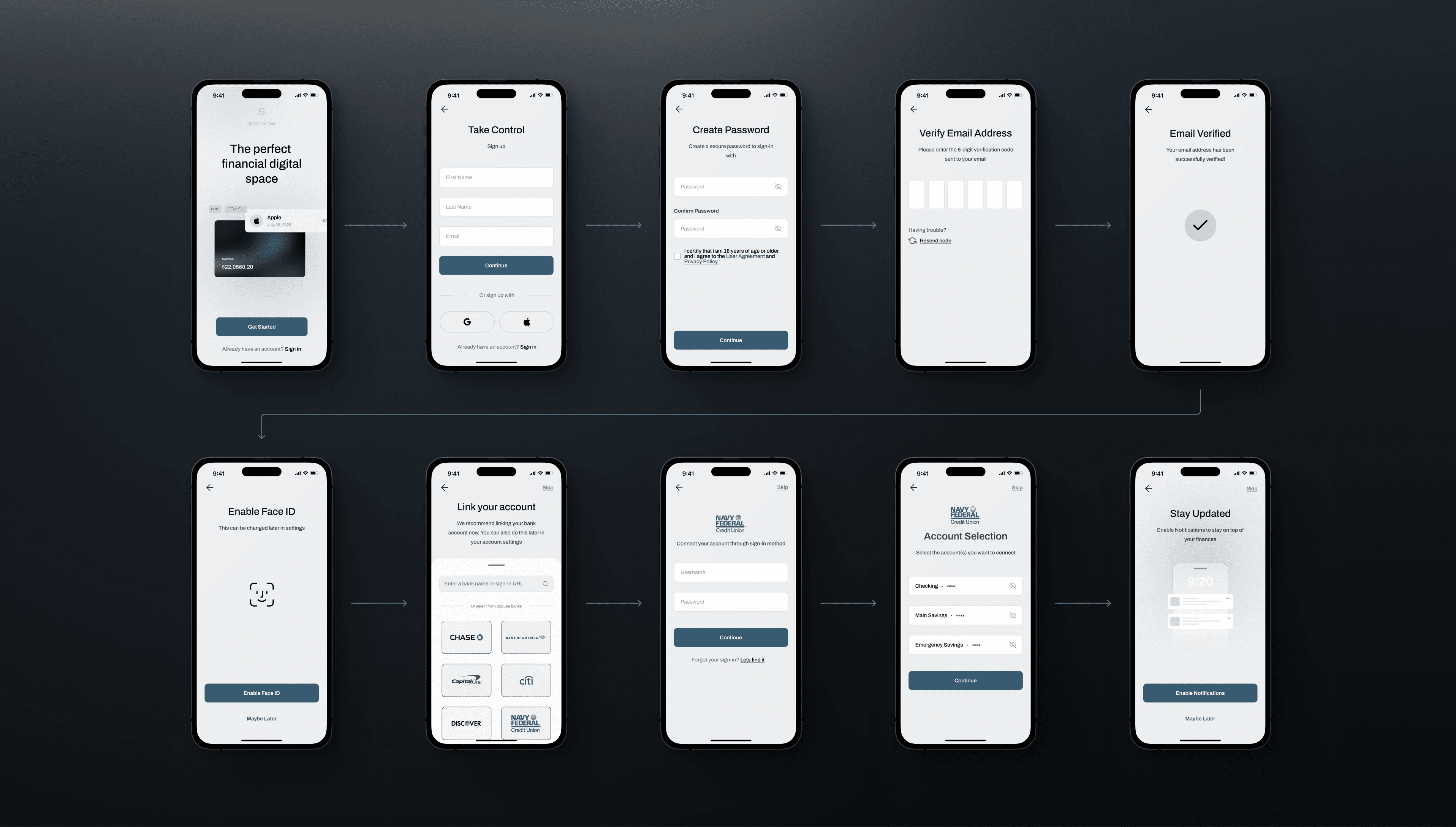
ONBOARDING
The Onboarding design prioritized minimizing screens without overwhelming users.
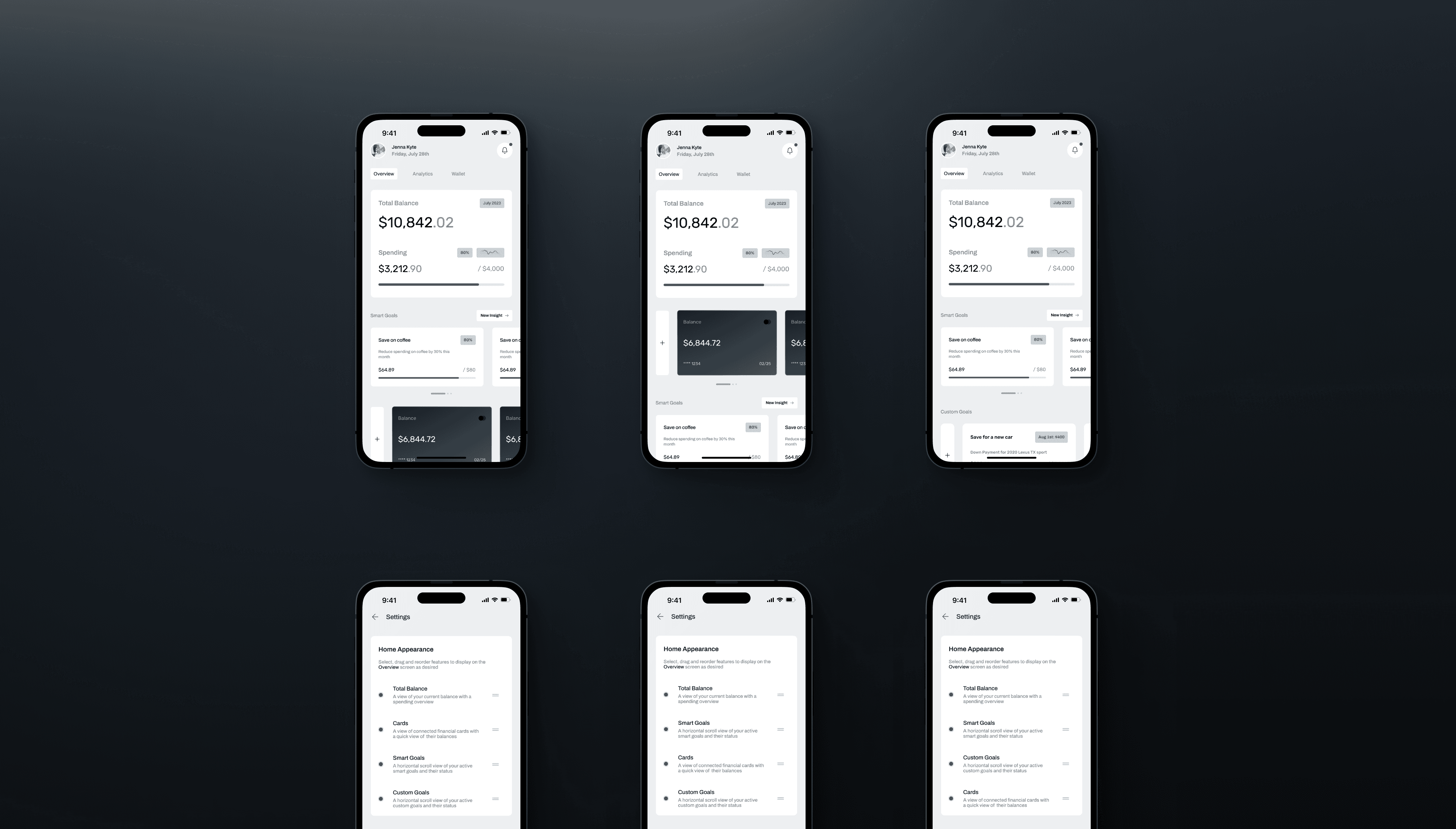
HOME
The Home screens hold a simple and effective design with room for customization to allow users to prioritize the most important features and components. Also allowing for future components to be added and reordered.
FORMATS
The main components and features were reformatted into watch faces and a responsive desktop dashboard.
PROTOTYPE
04
PROTOTYPE
Nearing the end of the project, it was highly important that I prototyped the Wireframes to test the functionality and usability of the flows. This would give me an effective understanding of the overall outcome I produced.
TESTING
05
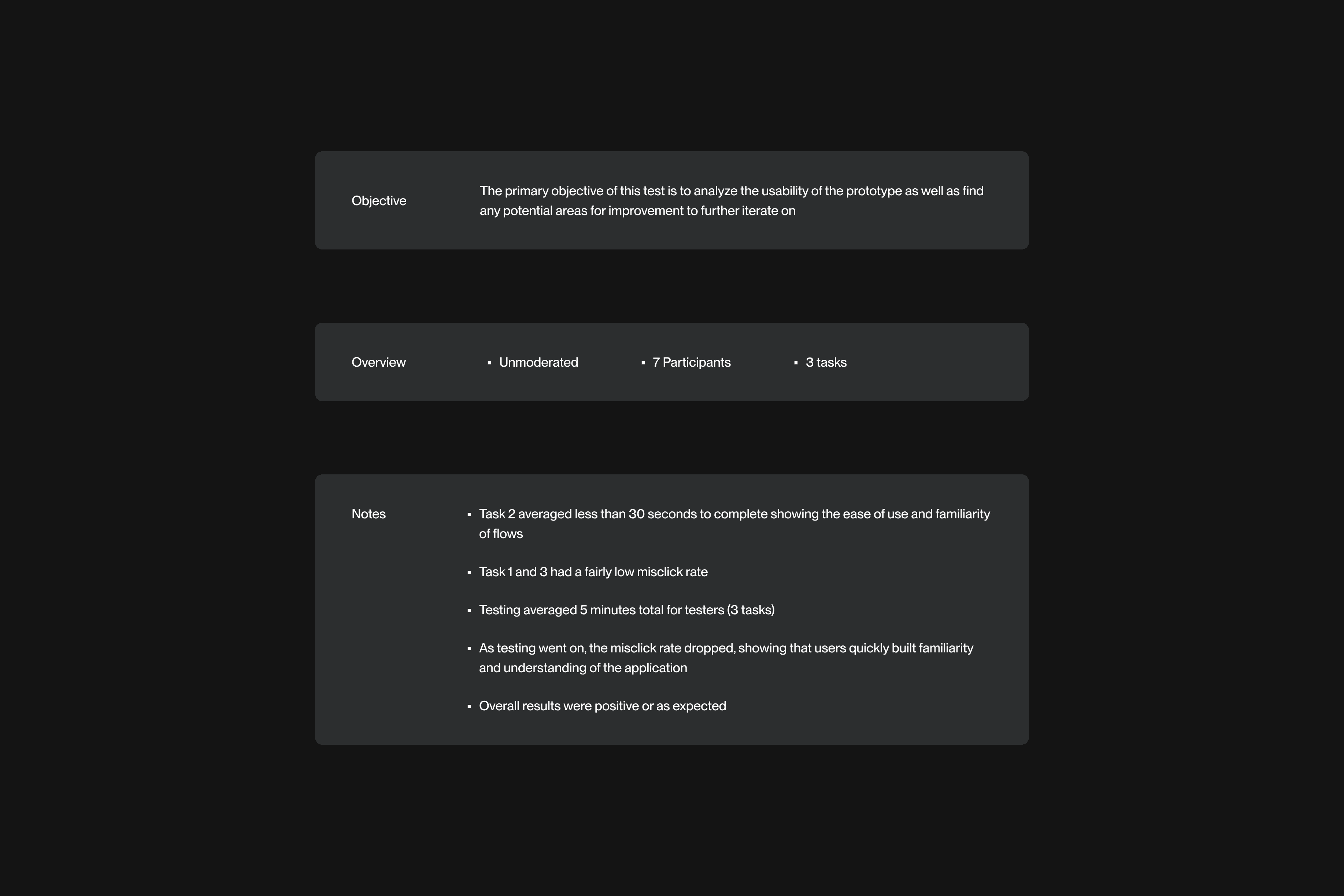
USABILITY TESTING
The final step was usability testing. This would allow me to find out the true level of usability of the product as well as present areas of improvement for final iterations.
FINAL PRODUCT
REFLECTIONS
Throughout the development of this financial management application, I encountered valuable lessons that have significantly contributed to my professional growth. One key takeaway revolves around the refinement of my visual hierarchy skills. In designing the user interface, I learned the art of prioritizing features effectively, ensuring that users can intuitively navigate and engage with the most crucial elements. This experience underscored the importance of understanding user behavior and how subtle adjustments in visual hierarchy can profoundly impact the user experience. Moving forward, I am excited to apply these lessons to future projects, ensuring that design not only meets aesthetic standards but also maximizes functionality and user satisfaction. This project has been a pivotal step in my journey toward becoming a more proficient and user-focused designer.
